Ferryway - Interactive Information Screen
University Group Project:
Designing an information screen for ferry travelers.
High-Fidelity Prototype
User Interviews
User Testing
User Research
January 2024

University Group Project:
Designing an information screen for ferry travelers.
High-Fidelity Prototype
User Interviews
User Testing
January 2024
The Ferryway project focused on designing a user-centered interactive information board for ferry travelers. The goal was to improve passengers' travel experience by providing clear navigation, itinerary details, and destination information, using a screen-based interface that was later adapted for mobile devices. The project followed the Double Diamond framework, guiding the process from research to a final digital prototype.
In my masters degree my 3 colleagues and me went through the whole double diamond framework in order to find out a problem ferry travelers have and in the end come up with a solution in the form of a high-fidelity prototype.
Tourists traveling by ferry in Stockholm’s archipelago often face confusion regarding ferry stops, routes, and activities available at their destination. The need for navigation clarity and accessible information about local attractions was a key issue highlighted during user research.
Finding out the problem ferry travelers have and following creating an interactive interface that should solve that problem.
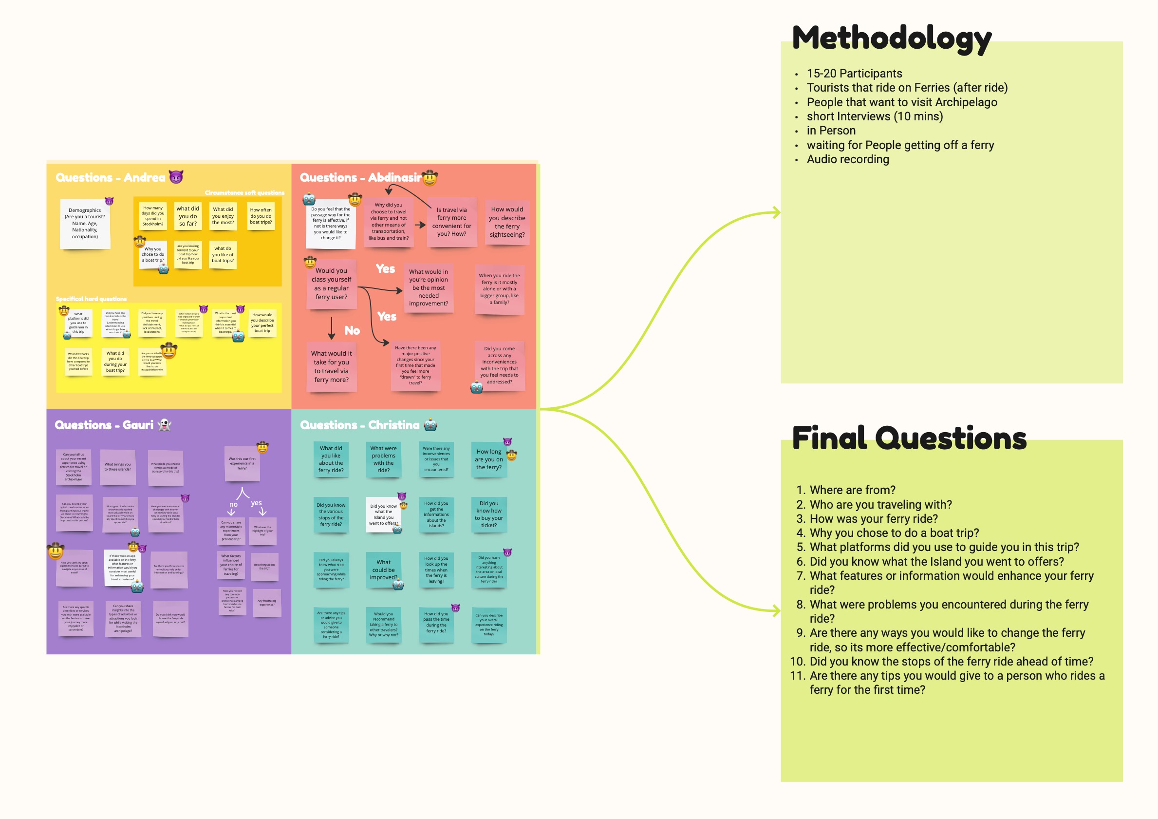
Our target users were tourists visiting Stockholm's Archipelago, a demographic unfamiliar with the ferry routes. Each of us interviewed 5 people, so 20 people in total. We waited for people to get off a ferry and then conducted short 10-minute interviews with them.
Through user interviews, we discovered that passengers wanted real-time location updates, clear itineraries, and information about the stops and nearby activities. The main problems the users mentioned were the following:
Below you can find the process of finding the questions and figuring out the methodology.
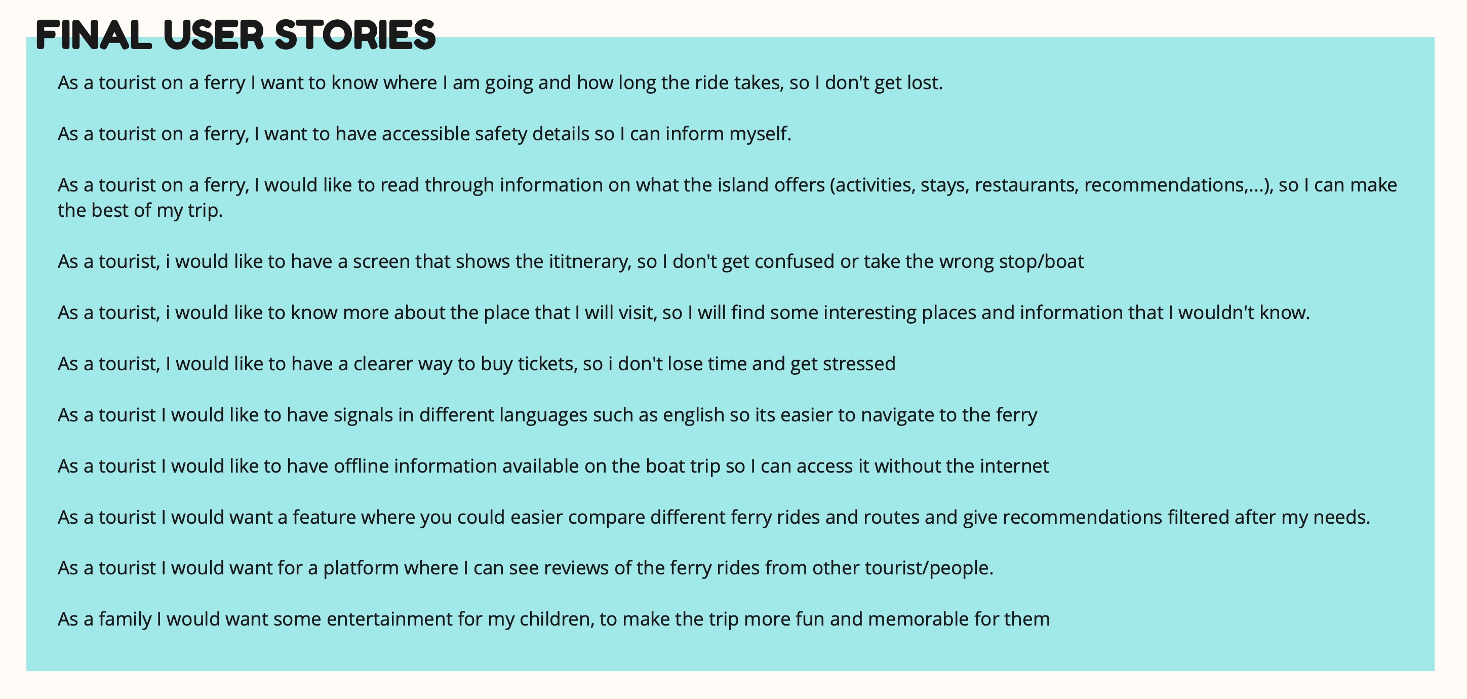
In this project, user stories were developed to capture the specific needs and goals of ferry travelers, particularly tourists. These stories helped define the main problems the users faced and guided the design process. The format used was:
As a [type of user], I want [some goal] so that [some reason].
From the collected user stories, the primary issue identified was a lack of navigation clarity during ferry rides. The user stories helped establish the acceptance criteria, focusing on providing explicit trip details, island-specific information, and offline access to vital information, shaping the development of the interactive information board.
You can see the final user stories below.
For the ideation we followed IDEO’s structured approach to generate creative solutions for the problems identified during user research. The goal was to develop ideas to address the challenges tourists face when using ferries, particularly around navigation clarity and access to information.
Before jumping into brainstorming, an organizational structure was established using a relational map, specifically a Tier List format. This popular framework, often used in online communities, was adapted to rank and categorize ideas based on their desirability and how well they addressed user needs. This structure helped prioritize the most promising ideas and discard weaker ones.
In order to guide the brainstorming session effectively, we used the following rules: defer judgement, encourage wild ideas, build on others' ideas, one conversation at a time, be visual and go for quantity.
We engaged in divergent thinking, focusing on generating a wide range of ideas rather than evaluating or selecting the best one immediately. Through that we explored a variety of concepts and this resulted in 35 unique ideas to solve the problem.
Below you can see the gathered ideas and the ranking in the tier list.
After thinking through the two leading ideas, we decided to move forward with the Interactive Information Board as it directly addressed the most critical user problem: navigation clarity. It offered a simple, user-friendly solution that met the identified needs of ferry travelers.


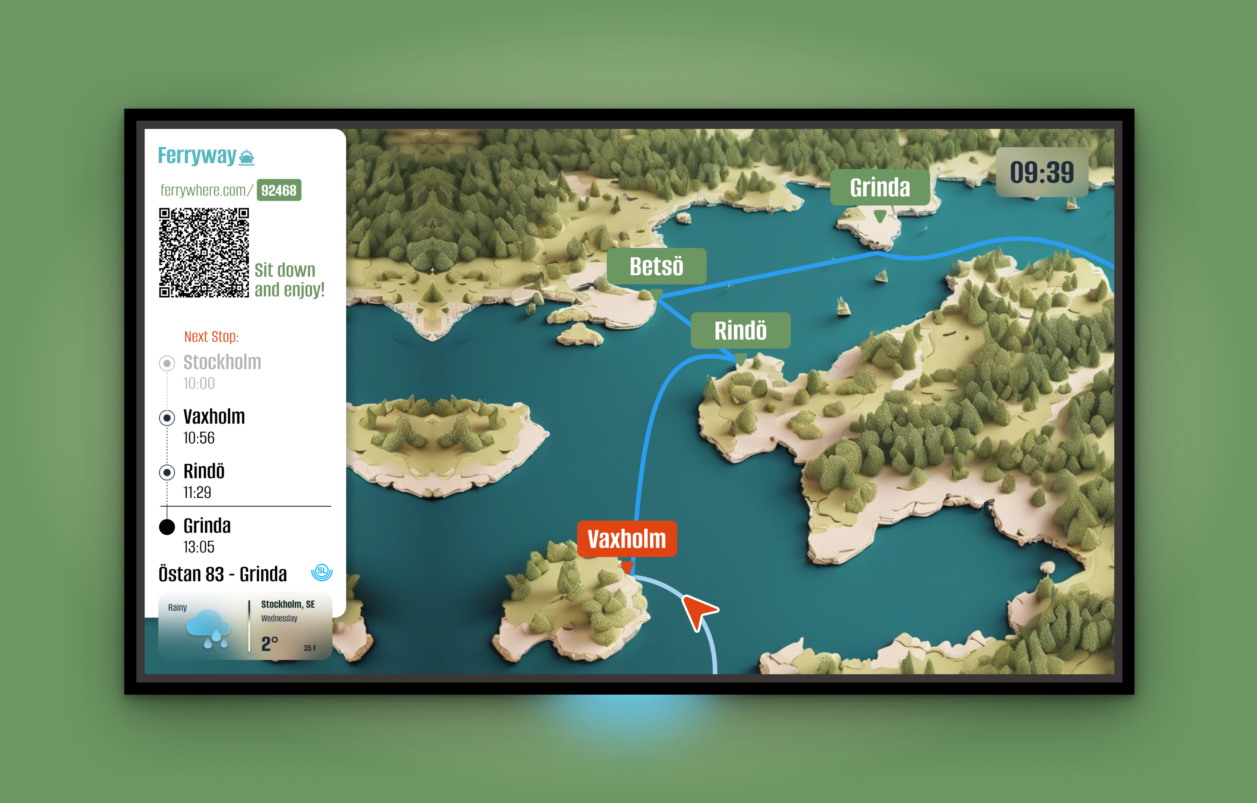
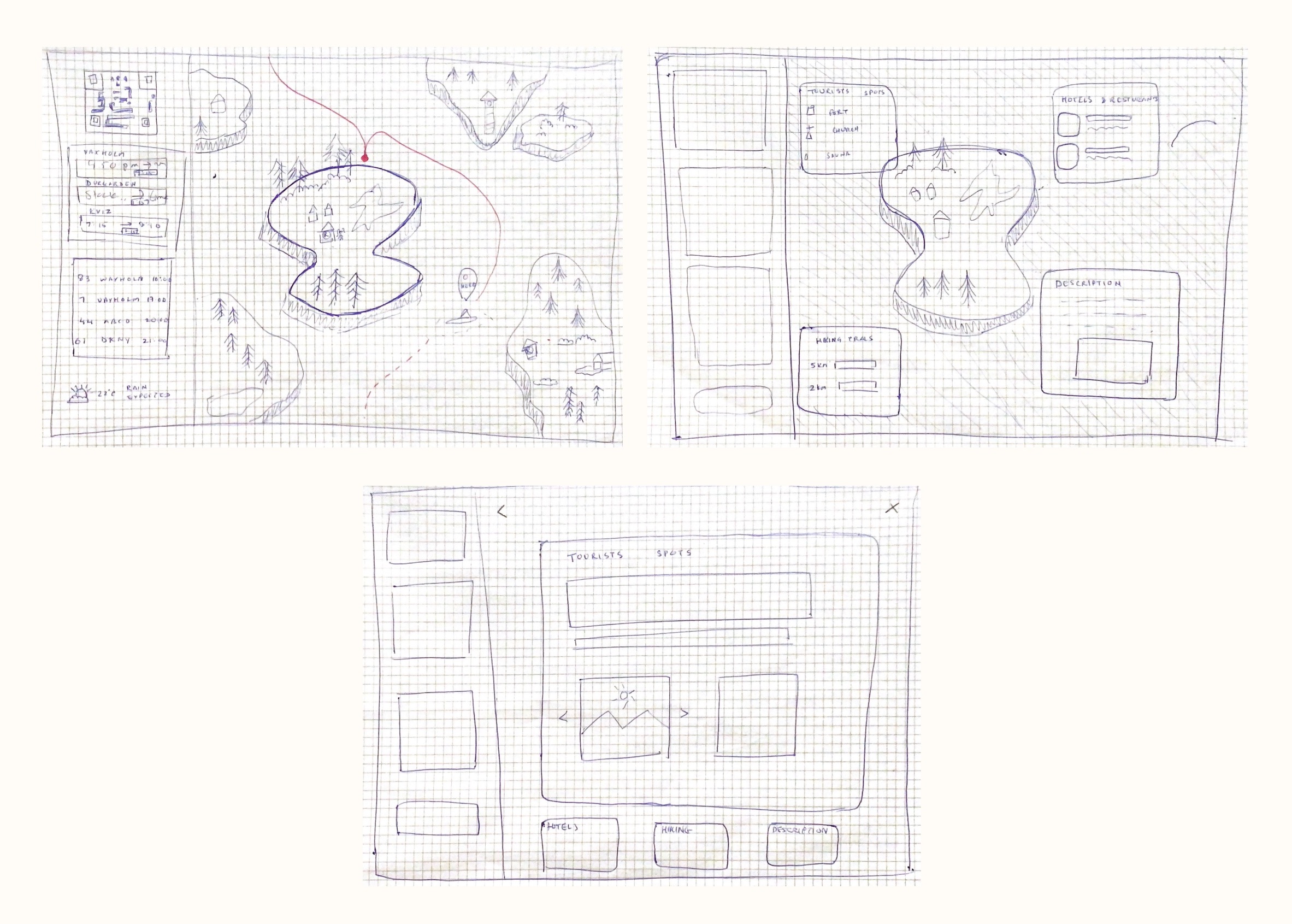
After deciding which design idea should be used, the process of creating a prototype started. The first step was to design a paper prototype. It was created to be able to test the idea as soon as possible and to see if the user group would accept it. The paper prototype is very minimalistic but carries the main function of the idea which should be tested. It consists of three screens. The first one shows the map where the ferry goes including the stops as well as the route and the location of the ferry. Furthermore the sidebar with the timetable, a ferry oversight, the weather and a QR-Code is pictured. Trough the QR-Code the users should be able to have the Screen on the mobile phone as well.
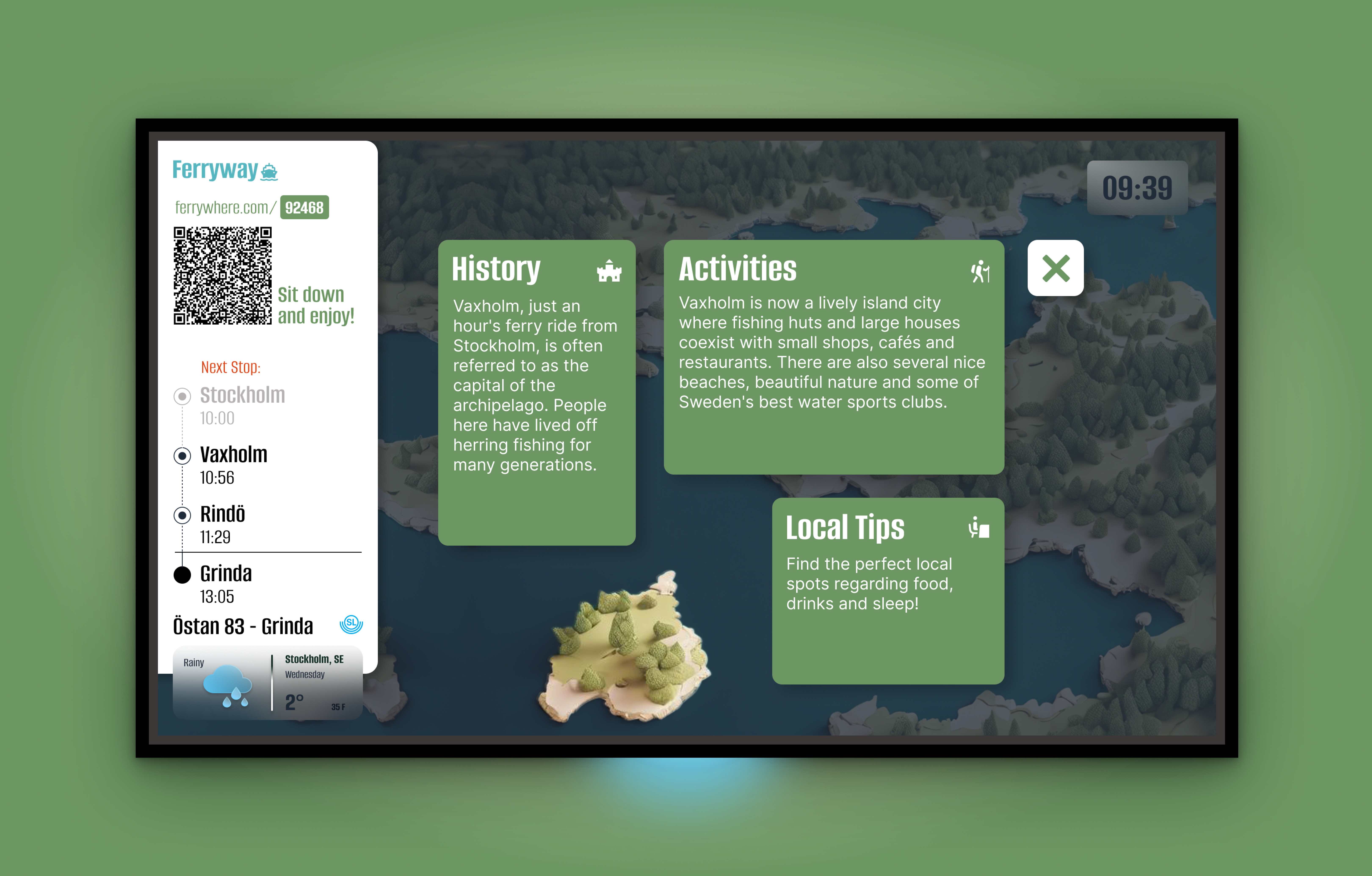
The second screen shows the Interactive Information Board when an island is tapped on. Here the focus lies on the island as well as various boxes with preview information.
On the third screen detailed information is displayed, based on the topic tapped on before.
Eight user tests were carried out to see if the features and the idea is accepted. The result of those tests were to create a phone prototype additionally to have an actual function for the QR-Code. Additionally the names of the stops should be presented clearer on the map itself. The ferry oversight should be removed because it was confusing to the users. Two questions that occurred were if other ferry routes should be shown and if islands can be selected when they are not included in the current route. It was decided not to show other routes or to be able to select other islands because this is overall not in the interest of the users and can be seen as confusing.
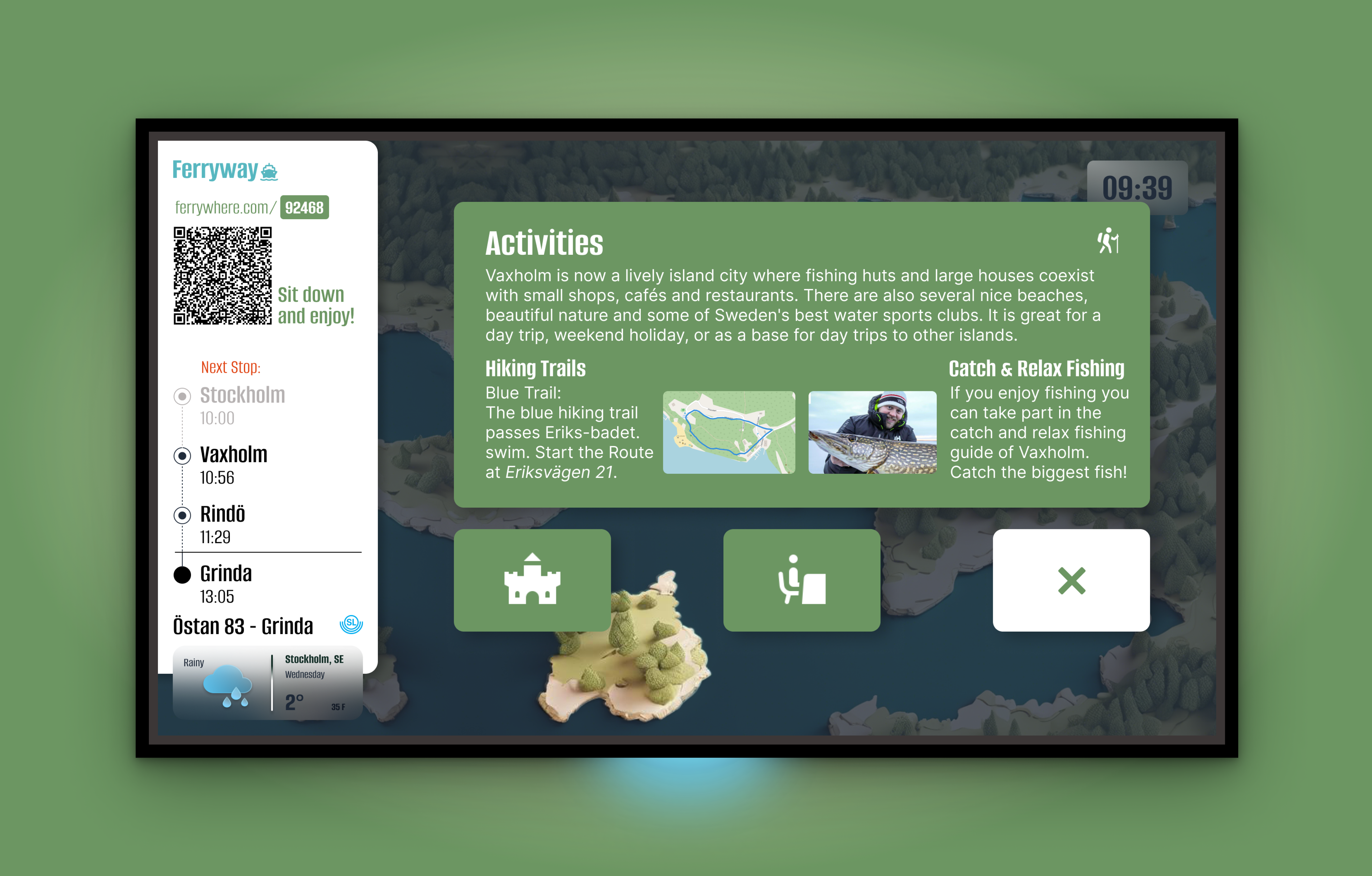
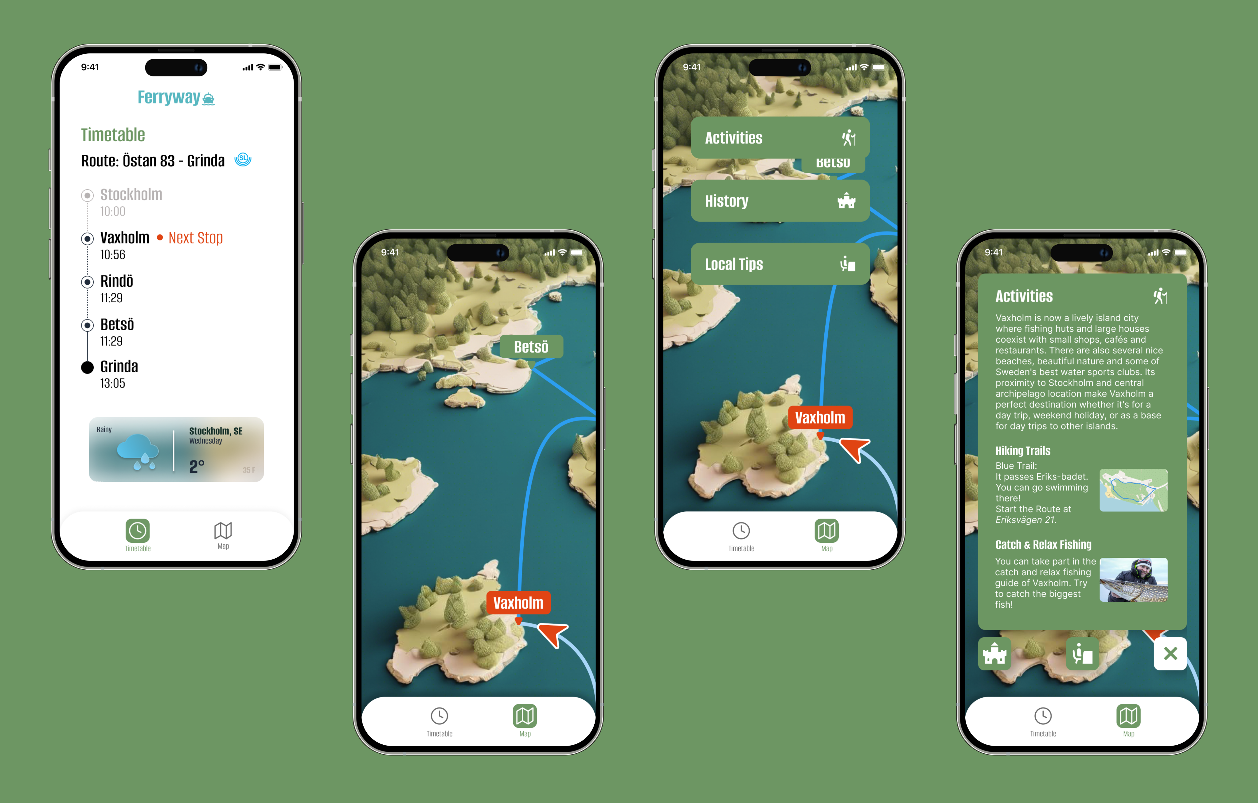
As we took the feedback from the paper prototype into account, there are 2 versions now. One main screen which will be attached inside the ferry and the mobile screen where the uses can see the information in parallel.
The Screen was designed to provide ferry passengers with an easy-to-use interactive map and real-time journey updates. It features a map of the ferry route with the current location marked by a GPS icon, allowing users to track the ferry’s position in real time. The map also highlights upcoming stops, which are displayed in green boxes, while the next stop is shown in a more prominent red box for clarity. A sidebar offers essential travel information, including a timetable, weather updates, and a QR code that passengers can scan to access the information on their mobile devices. Additionally, passengers can tap on islands along the route to explore local attractions and receive detailed information about activities, dining, and historical landmarks. This interface was designed with simplicity and accessibility in mind, making it easy for tourists to navigate and stay informed throughout their journey.
The Mobile Version was created as a companion to the ferry’s screen interface, allowing passengers to access the same detailed travel information on their smartphones. Upon scanning the QR code from the screen, users are taken to a mobile-friendly version of the interface, which features a simplified navigation with a bottom menu for easier access to key functions like the map, itinerary, and weather updates. The landing page presents the ferry timetable and other essential details, ensuring that passengers have quick access to important travel information right away. Users can explore islands and stops along the route by tapping on boxes that display activity and sightseeing options, presented in a carousel format for easy scrolling. The mobile prototype was designed to offer a seamless experience, enabling passengers to keep track of their trip even when they’re away from the screen interface.
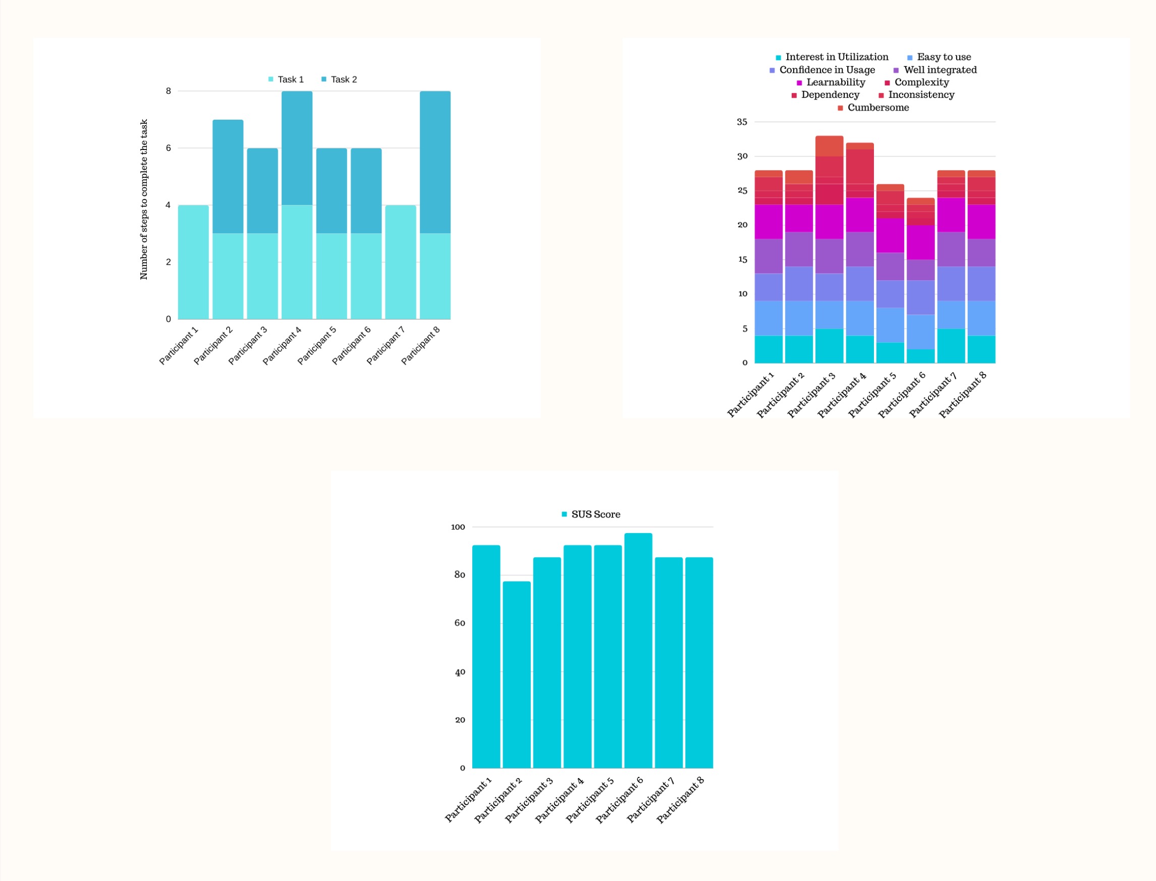
During the User Testing, eight participants, aged between 20 to 56 years, familiar with ferry travel were recruited to evaluate the usability of both the screen and mobile digital prototypes. The testing involved tasks such as locating local tips on an island and using the QR code to access the mobile version. Participants were asked to think aloud while performing these tasks, allowing us to observe their navigation and identify pain points. The majority of users found the system intuitive and useful, particularly appreciating the interactive maps and detailed stop information. However, some struggled with closing the sidebar and navigating the mobile version, especially older participants. Feedback from these tests led to key improvements, including enhancing the visibility of clickable elements and refining the mobile navigation with a bottom menu. Overall, the system received a strong SUS score of 89.375/100, indicating a high level of user satisfaction.
The Final Prototype of the Ferryway interactive information board features several key improvements based on user feedback, resulting in a more intuitive and visually refined interface. The screen version offered a dynamic map with real-time GPS tracking, highlighting completed and upcoming ferry route segments in distinct colors for better clarity. Users could tap on islands to access detailed information about activities and landmarks, while an upgraded font ensured easier readability. A GPS overlay was added to provide estimated arrival times for each stop, and the interface now included a cross icon to close preview boxes, giving users more control over interactions. The mobile version was enhanced with a bottom menu for easier navigation, clear topic boxes for information, and a consistent design with the screen interface. Together, these improvements created a seamless and user-friendly experience for ferry passengers, ensuring they had all necessary travel information at their fingertips.
The project successfully created a user-friendly, interactive system for ferry travelers. Future enhancements could include expanding the geographic coverage of the information board, adding advanced features such as augmented reality, and improving accessibility for diverse user needs.