OÖN - News App Redesign

In Short

University and Company Group Project:
Redesign of a News App from OÖN as a High-Fidelity Prototype on the basis of Benchmarking.

Deliverables
High-Fidelity Prototype
User Testing
My Role

Research
Design
Prototyping
User Interviews
Client Presentation

Completed

June 2022

Project overview

The OÖN News App redesign project aimed to create a modern, user-centric mobile experience for Oberösterreichische Nachrichten, a leading Austrian newspaper. The goal was to increase user engagement, attract younger audiences, and boost subscription rates by enhancing the app’s UX/UI.

Redesigning the News App from OÖN

In my bachelors degree my 8 colleagues and me collaborated on this studyproject with Flixeder Landtechnik GmbH. The project involved project planning, wireframing the user flows and pages needed as well as implementing the website with wordpress to meet the client’s needs effectively. We organized our efforts into specialized groups focusing on development, design, and content creation, ensuring a seamless workflow throughout the project. By prioritizing performance and SEO optimization, we delivered a responsive site that enhanced the company's online presence.


Learning Agenda

Figma
Design System
User Research
Project Management

Client

Oberösterreichische Nachrichten (OÖN) is a regional daily newspaper in Upper Austria that covers local, national, and international news, focusing on topics relevant to the region.

The Challange

The existing OÖN app was outdated, offering little differentiation from the mobile web version (nachrichten.at). The app primarily served ePaper subscribers but lacked engagement features to attract new users, especially younger demographics. Our task was to redesign the app to reflect modern UX/UI standards, improve functionality, and enhance the overall user experience.

Goal

The goal of this project is to create a concept and design that adheres to modern UX and UI standards, so the app is enjoyable for users. The new app should also integrate the ePaper, enhance user engagement, and increase login rates as well as attract a younger readership and gain more newspaper subscriptions.

Research

The first milestone in the project was the research which involved simple user interviews, Brainstorming and Benchmarking.

User Interviews

The team interviewed 12 potential users aged 20-27 to understand their expectations for a news app. This feedback was critical in shaping the app’s feature set and design goals.

Benchmarking

The team conducted a thorough competitor analysis, focusing on other news apps like Die Presse, Salzburger Nachrichten, and ntv Nachrichten. This analysis helped identify best practices and gaps that the OÖN app could capitalize on.

Brainstorming

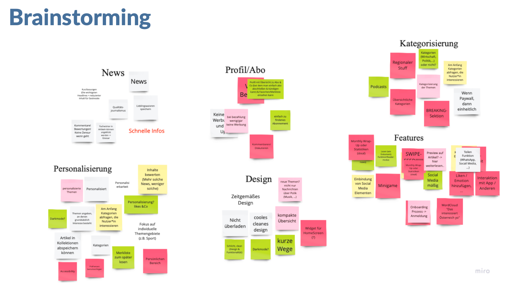
All team members contributed ideas in response to the prompt, “What does a modern news app need in 2022?” This collaborative session led to identifying key areas like news categorization, personalization, design, and features.


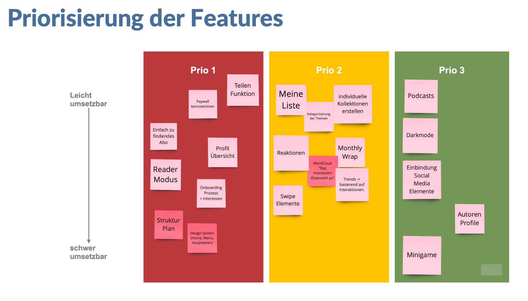
Following our research, we identified core areas for improvement which are personalization, improved naviagation, subscription features adn modern aesthetic. Based on those areas we then prioritized specific features.
Ideate - Wireframes

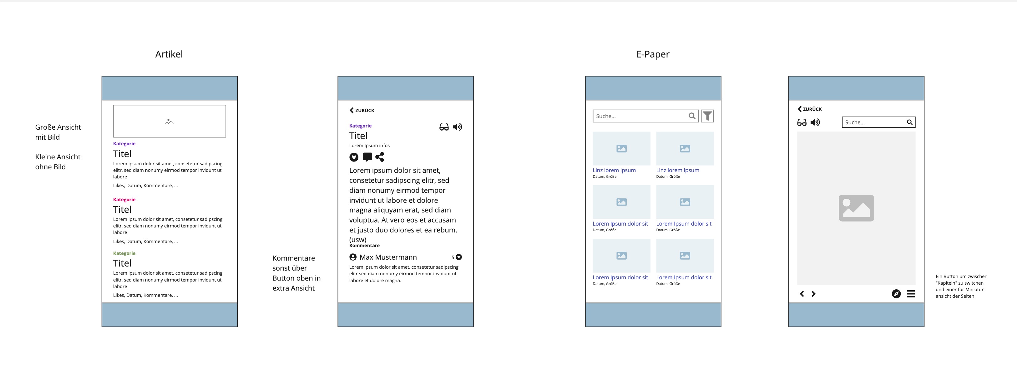
Initially, basic wireframes were developed on Miro to outline the app’s core functionality, layout and navigation flow. We reviewed the wireframes in weekly team meetings and iterated based on feedback from our supervisors and stakeholders at OÖN.

Design - Prototype

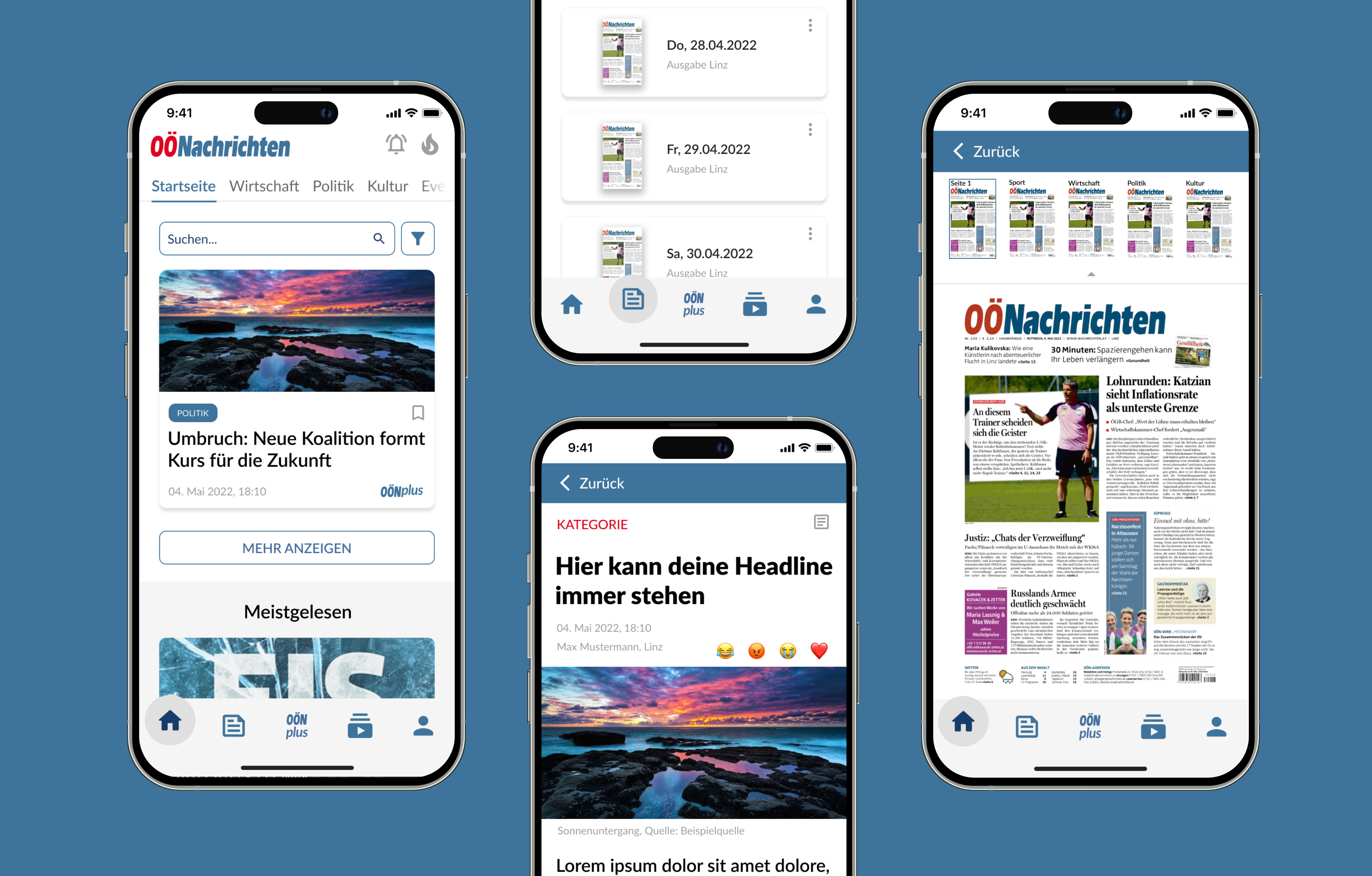
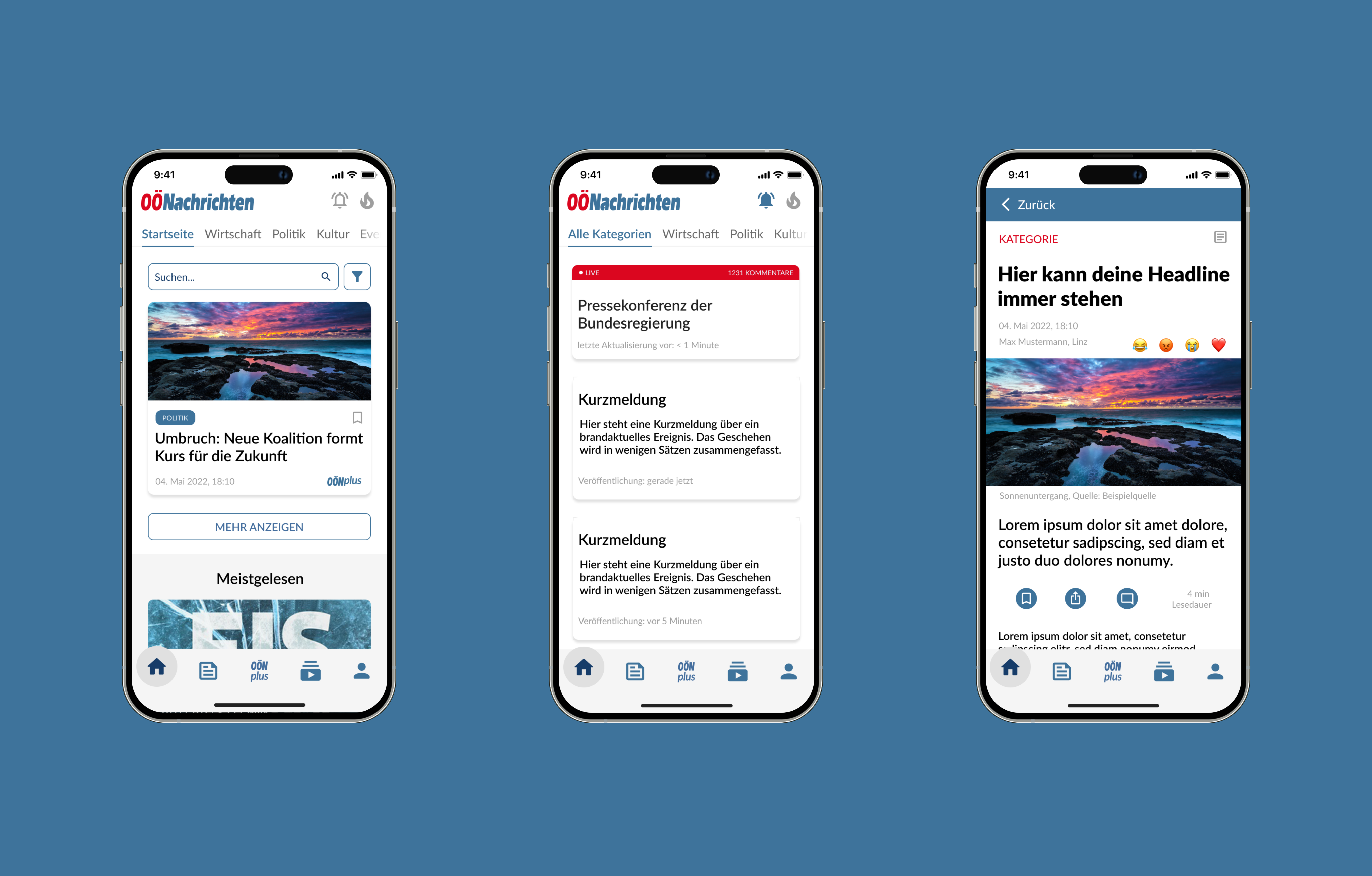
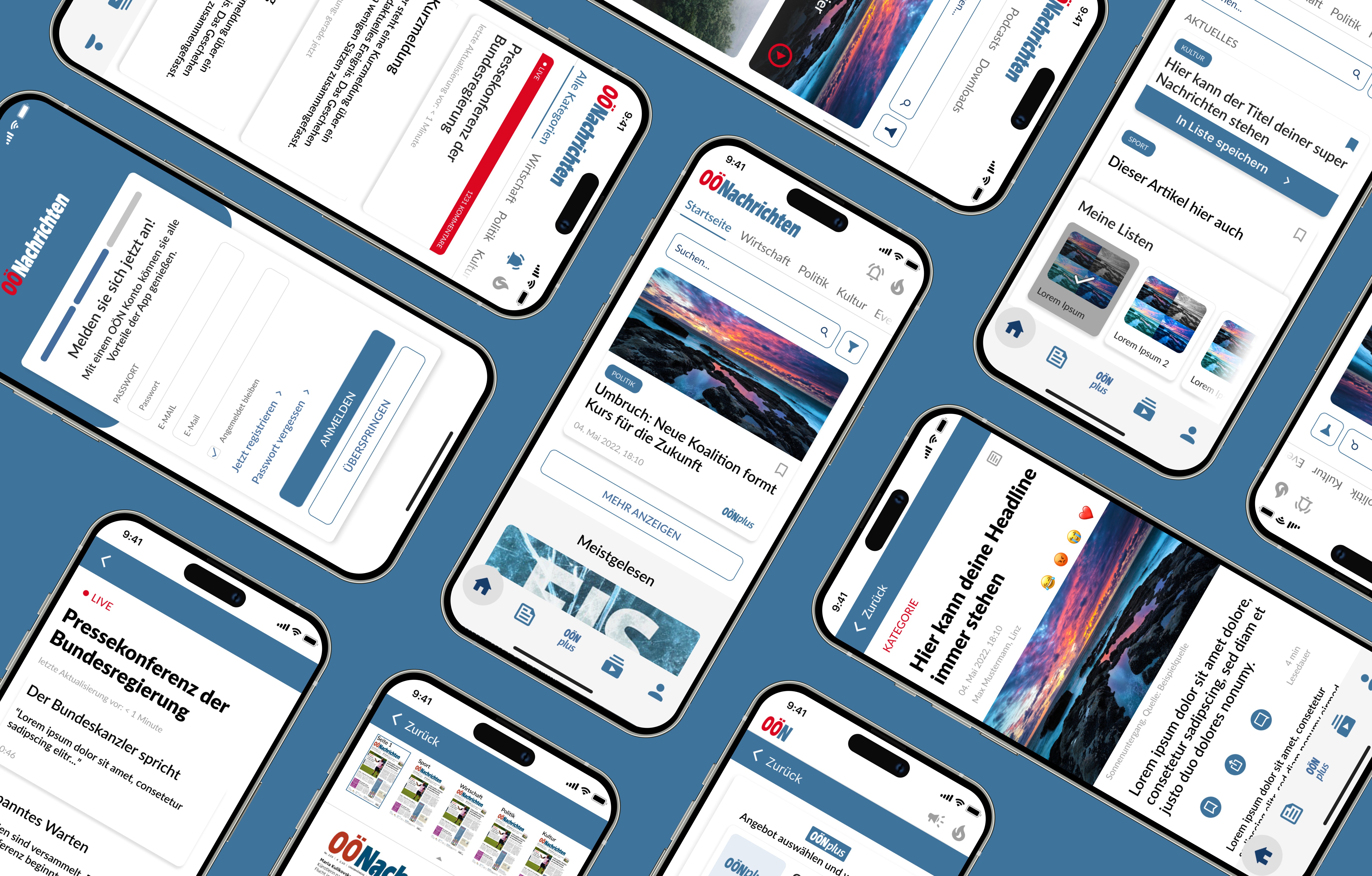
After getting feedback on them, the wireframes evolved into high-fidelity prototypes (made with Figma), that included UI elements, color schemes, and final navigation models. A design system was established, which included reusable elements like buttons, icons, and navigation components. This system helped maintain consistency throughout the project, especially as it was multiple people creating the prototype. The design was modular (using components), ensuring that components could be easily updated across different parts of the app.

Color Palette:We incorporated OÖN’s signature red and blue, paired with neutral greys to maintain brand identity while modernizing the look.

Typography:The “Lato” font, already used in the OÖN branding, was selected for its readability and clean design.


Usability Testing

The team conducted usability tests with eight users, aligned with the app’s target demographic. Each user completed a set of tasks while providing verbal feedback on their experience. This was crucial in identifying pain points and areas for improvement. The key focus areas were the Onboarding Flow as well as Navigation and Interaction.

Key Findings:

  • Navigation Issues: Some users found the onboarding highlights and navigation unclear. This led us to increase the contrast of important buttons and improve the visual hierarchy.
  • Subscription Clarity: Users had difficulty finding the subscription options. We adjusted the interface to make OÖN Plus more prominent and accessible.
  • Login Flow: The login process was refined based on feedback, simplifying the password recovery process and improving the flow for returning users.

Final Deliverables

We delivered a complete set of assets, including high-fidelity mockups, interaction specifications, and design documentation. The final app design was well-received, offering a streamlined user experience that balanced functionality with a modern, appealing aesthetic. The enhanced navigation and personalized features created a more engaging user journey.

Conclusion

The OÖN News App redesign transformed an outdated platform into a modern, user-friendly experience. Through thorough research, iterative design, and constant user feedback, we delivered an app that not only meets business objectives but also resonates with the target audience. This project showcases my ability to manage complex UI/UX design processes, from research and ideation to testing and final delivery.

Check other projects

see all